Cracker Barrel
- Year —
- 1977–2025
- Designer —
- Cracker Barrel brand team
- Outcome —
- Reverted
The Old Timer came back within a week. The remodel plan was dropped later.
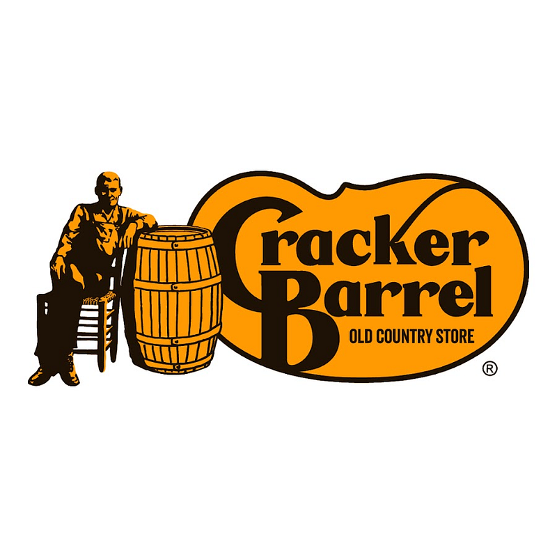
Since the late 1970s the Cracker Barrel sign was a man leaning on a barrel — Uncle Herschel, the Old Timer — inside a brown badge. Folksy on purpose. The restaurants are folksy on purpose. You could draw him from memory, which is a stupidly high bar for a roadside logo and one almost nobody clears.
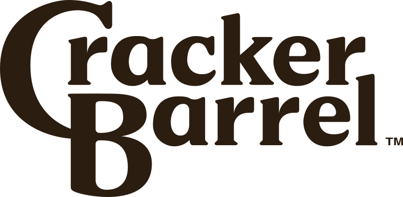
On 19 August 2025 the man came off. What remained was “Cracker Barrel” in a serif, inside a rounded rectangle, as part of a campaign the company called All the More. They billed it as the first real identity shift in almost fifty years. The figure that made the sign a picture became a word on a plaque.
A character you can doodle is rare
People who eat there, and people who don’t, treated the missing figure as a statement about the restaurants. Some of that was culture-war noise. Some of it was simpler: the man was the sign. Take him off and you have a generic Southern restaurant badge, interchangeable with a dozen others on the same stretch of interstate. Shares dropped on the order of seven to ten percent in the days after the reveal. Reporting at the time put the one-day hit near a hundred million dollars.
On 26 August the company posted that the new logo was going away and the Old Timer would remain. BBC News and CNBC both had to cover a restaurant mark as national news. The remodel plan, which had already been making some dining rooms look like a different chain, got walked back later.
Gap lasted six days. Cracker Barrel lasted a week. The rhyme is not accidental. Both took a picture people used to find the place and replaced it with type. Gap’s picture was a box. Cracker Barrel’s was a person. Type is easier to put on a phone. It is also easier to forget on a highway.
The Old Timer was not decoration
A lot of the coverage framed this as a company getting yelled at for modernising. That undersells the drawing. Uncle Herschel is a caption. He tells you what kind of hospitality you are supposed to expect before you have read a menu. A wordmark cannot do that unless the words are already famous for a feeling, and “Cracker Barrel” without the man is just two nouns.
IHOP flipped a letter for a month and then admitted the pancakes were not optional. Cracker Barrel learned the same thing about the figure on the barrel, faster, and under a much brighter light. The man is back on the sign. That is the correct ending for a logo that was already doing the work.
- Cracker Barrel scraps new logo after backlash, BBC News, 27 August 2025
- Cracker Barrel scraps new logo after Trump criticism, CNBC, 26 August 2025
- Cracker Barrel’s first rebrand in nearly 50 years backfired, Fortune, 22 August 2025