Gap
- Year —
- 1986–2010
- Designer —
- Laird + Partners
- Outcome —
- Reverted
Pulled after six days. The blue box is still the mark.

For 24 years Gap was a navy square with white letters in it. You could see it on a bag from the other end of the mall. That is not nostalgia talking. It is how a clothing logo has to work: across a car park, on a hanging tag, folded into a pocket. The box did the job because it was an object, not a typesetting choice.
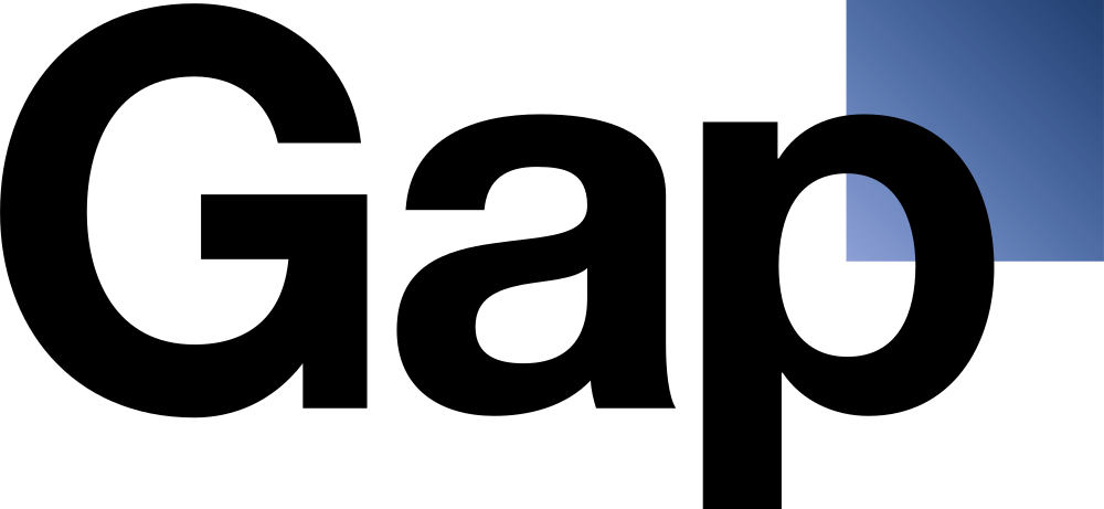
In early October 2010 that square became Helvetica next to a little blue-black gradient chip. Laird + Partners, a New York fashion agency, wanted it to feel current. Marka Hansen, then president of Gap North America, called the new Gap logo more contemporary. On a white webpage it looked like a bank that sold jeans.
Six days of Helvetica
The old mark disappeared almost overnight, first on gap.com. Facebook and Twitter filled up. A parody account appeared. Sites asked people to draw their own Gap logos and filled up with jokes, some of them better than the official drawing. On 12 October, six days in, Hansen said they had not gone about it the right way and the box came back.
Gap later floated a crowdsourcing idea, then dropped that too. The useful admission was smaller: they had missed how much energy already sat around the blue square. You cannot “engage the community” after you have already replaced the thing the community was looking at.
BBC News treated it as a lesson while the paint was still wet. The lesson is not “never change a logo.” It is that a retailer logo is a wayfinding device. Helvetica Bold cannot hold a shopping bag together the way a box can.
Why the leftover square gave the game away
The 2010 drawing still needed a scrap of blue. The gradient chip behind the p was a tell: they still wanted an object, they just did not want it to be the one people knew. A tiny square is not a memory of a big square. It is an apology that got printed.
Gap’s serif-in-a-box had been around since 1986, with small updates. It was not fashionable in 2010. That was the point. Fashion brands that last do not dress like the season they are selling. They dress like a place you can find again. American Apparel-adjacent Helvetica was already everywhere in 2010. Putting Gap in that crowd made the name smaller, not newer.
The revert stuck. Walk into a Gap now and the navy square is still the mark. The six-day version survives as a cautionary slide, usually next to Tropicana and, later, Cracker Barrel. Those three are not the same mistake, but they rhyme. Each one took away a picture people used to locate the brand, and discovered that “cleaner” is not a location.
If Instagram’s r is a reading error, Gap was a finding error. Nobody misread GAP. They just could not see Gap anymore.
- Lessons to be learnt from the Gap logo debacle, BBC News, October 2010
- Gap stops thinking outside the box, The Independent, October 2010