IHOP
- Year —
- 1958–2018
- Designer —
- IHOP
- Outcome —
- Reverted
The P came back after a month. The company later called the rename a fake-out.
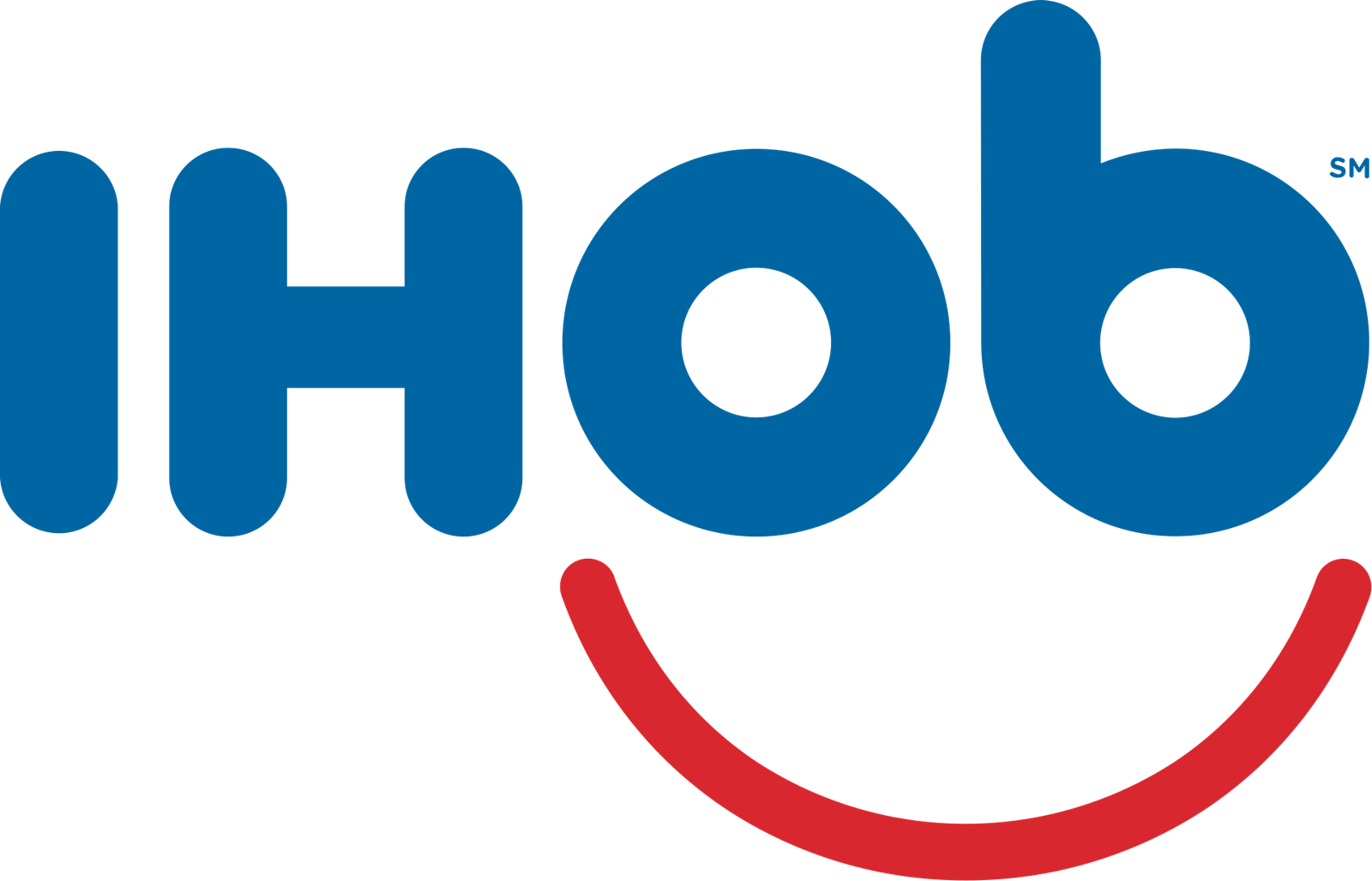
IHOP’s letters end in a P that everyone already expands to pancakes. That is the whole identity, plus a red smile. On 11 June 2018 the P became a b. The smile stayed. The name on Twitter, the site, and at least one Hollywood restaurant did not. International House of Pancakes spent a month as International House of Burgers.
They were launching Ultimate Steakburgers and wanted lunch traffic. Teasers asked what the b stood for. Wendy’s and Denny’s piled on. IHOP said the burgers were staying even if the name wasn’t. The campaign did what a lot of restaurant stunts want to do: it got on television for free. It also announced, in one letter, that pancakes were optional.
Change one letter and you have changed the product
Customers heard that louder than “try the steakburger.” The smile still looked like breakfast. The b did not. A logo that is also an acronym cannot play with the last letter and expect people to treat it as a wink. The last letter is the punchline. Flip it and you have told the room the act is over.
On 9 July, in time for a 60-cent short stack for the sixtieth year, the P came back. Facebook copy: they would never turn their back on pancakes, except for that time they faked it. Stephanie Peterson said the campaign did what it intended. Burger sales, they said, jumped. CNBC recorded the walk-back. The company later leaned into the fake-out reading, which is a convenient way to describe a rename you have already undone.
Maybe the burgers did sell. That does not make IHOb a better mark. It makes it a commercial that got printed on a restaurant. HBO Max dropped three letters for scale and had to put them back because the remaining word meant nothing. IHOP dropped one letter for lunch and put it back because the remaining word meant the wrong meal.
The smile was doing breakfast. The P was doing the name.
Gap and Cracker Barrel took pictures off signs. IHOP kept the picture and vandalised the caption. That is a more honest kind of stunt, and still a bad logo decision if you let it sit. A month is long enough for menus, apps, and a Hollywood dining room to look like a different chain.
The P came back. Pancakes were never optional. If you need people to try the burger, print the burger. Do not hold the last letter of the name hostage and call it a conversation.
- IHOP changes name back from IHOb, CNBC, 10 July 2018