Jaguar
- Year —
- 1930s–2024
- Designer —
- Jaguar brand team
- Outcome —
- Kept
The leaping cat is off the primary identity. The letters stayed.
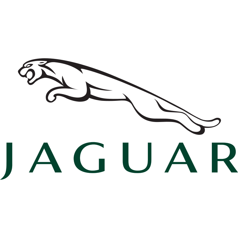

Jaguar’s Leaper is a body in mid-spring. Even as a chrome blob at the far end of a car park you knew what it was. That is a high bar for a car badge, and the company had cleared it for decades: bonnet, tail, watch face, classifieds thumbnail. In November 2024 they put the cat away as the primary identity.
Production was pausing. The next Jaguar would be electric and, they said, luxury. Gerry McGovern called it a complete reset. The film was called Copy Nothing, after a line from founder William Lyons. No car in it. Models in colour. Slogans about deleting the ordinary. The new Jaguar logo is a long, widely tracked mixed-case wordmark — JaGUar — the sort of thing a clothing line uses when it wants to look like it has a concept.
A car mark has to work on a moving object
Car logos are not posters. They have to survive mud, distance, a wet motorway, and a 120-pixel listing on a used-car site. The Leaper did, because it was a silhouette with a verb in it. Six spaced capitals, some of them lowercase, tell you the name and leave the rest behind. You can read Jaguar. You cannot see a jaguar.
They still have a badge for places that need a badge. Jaguar calls it a Maker’s Mark: a geometric leaper, more device than animal, plus a J/r monogram that looks the same upside down. Clever on a slide. On a grille, clever is slower than a cat.
The Verge and Dezeen both had to explain that this was a car company. That should not be the first job of a launch. American Airlines ran into a cousin of this problem in 2013: replace a reduced eagle with a mash of patriotic parts, then discover that clever is harder to remember than a bird. Twitter did the overnight version with the bird. Jaguar did it with a campaign that looked embarrassed to be selling vehicles.
The letters have not been withdrawn
The cars they were meant to introduce were still ahead of the announcement. A concept showed up in Miami a few weeks later. Owners of actual Jaguars were asked, in the meantime, to accept that the leaping cat had become heritage rather than the face of the company. Heritage is what you call a logo after you have decided it is in the way.
Lyons’s line was that a Jaguar should be a copy of nothing. That was an argument about the cars. Using it to justify a wordmark that looks like several other luxury rebrands of the last ten years is a different claim. Copying nothing would have been keeping the animal and putting it on an electric bonnet.
The letters stayed. The cat is still around if you know where to look. Primary identity is the one that shows up when you are not looking. For a century that was a leap. Now it is tracking.
- Jaguar is now JaGUar, The Verge, 19 November 2024
- Jaguar unveils rebrand for “complete reset”, Dezeen, 21 November 2024
- Jaguar brand film Copy Nothing, 19 November 2024