- Year —
- 2016–2026
- Designer —
- Design at Meta
- Outcome —
- Rolling out
Rolling out now. Instagram has not pulled it.
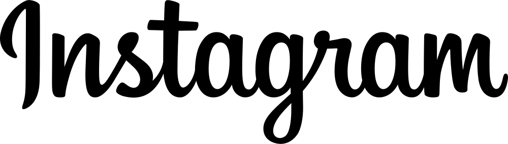
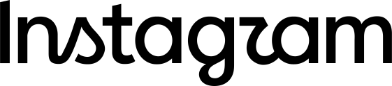
Instagram’s 2026 logo redesign is a wordmark problem, not an icon problem. The camera glyph stayed. The letters at the top of the app did not. On 13 August 2026, Adam Mosseri posted a new drawing and said the old script had sat there for ten years, so it was time. By evening a lot of people, including The Verge, were reading Instagzam.
This site exists because of that misreading. The rest of these pages are older versions of the same mistake: a company had a mark people could find, then swapped it for something tidier.
Why the new Instagram wordmark reads as Instagzam
Look at the r. The shoulder is square and the counter is small, so the letter sits against the g like a z. That is not a stretch once you have seen it. Commenters got there in about an hour. Mosseri had already posted the mark to Threads to “see what the hot takes might be,” which is a polite way of admitting the drawing would have to survive being read, not just presented.
The 2016 letters were a bit messy and obviously a name. Loops, joins, uneven weight. You did not have to like handwriting to know what it said, because the word Instagram is long enough that a few awkward joins still resolve as the product you already opened. The 2026 version is a hybrid. Some joins stayed. The rest got squared up. Creative Boom noted that the leftover loops live on the s, the r, and the g. That is where the crash is. You cannot modernise three letters and leave them attached to a name that still has to be parsed at a glance.
TechCrunch made the other fair point: most people will still know which app this is. Recognition of the product is not the same as legibility of the letters. A logo that you can identify from context has already failed a quieter test, which is whether a stranger could copy it down.
What Design at Meta changed besides the letters
The same day, Design at Meta published a longer piece: hundreds of trials, they kept coming back to script, then they tightened it. They also shipped Instagram Sans, Instagram Pen, and Instagram Mono, promised quieter motion, and said the gradient would stay but get used with more restraint. None of that is in the r.
The last time Instagram really changed how it looked was 2016, when the brown camera with the rainbow stripe became the flat sunset glyph that still sits on the home screen. That icon survived this refresh. The wordmark did not, which is the opposite of how most social apps age. Icons get flattened. Wordmarks usually get left alone because they have to say the name. Instagram did the hard part last.
Mosseri’s line was “cleaner and more modern, with references to the original.” Cleaner is doing a lot of work. A script that has been ironed still has to behave like a script. If the joins only survive on the letters that already cause trouble, you have kept the costume and lost the sentence.
Instagram has not pulled it
Gap lasted six days. Tropicana lasted two months. Instagram is still rolling the letters out, with the rest of the system promised through 2026. That does not make the r a z any less. It just means Meta is willing to wait for people to stop saying it.
A wordmark is a piece of type that has to survive being a name. The 2016 drawing did that without being beautiful. The 2026 drawing wants to be both a signature and a product sans. Those two jobs fight in the gap between r and g.
- This is Instagram’s new logo, Jess Weatherbed, The Verge, 13 August 2026
- Instagram introduces a redesigned wordmark, TechCrunch, 13 August 2026
- Built to celebrate creativity: the new Instagram brand identity, Design at Meta, 13 August 2026
- Instagram reveals its first brand refresh in 10 years, Creative Boom, August 2026