Weight Watchers
- Year —
- 2012–2018
- Designer —
- WW
- Outcome —
- Reverted
The full name returned in December 2025.

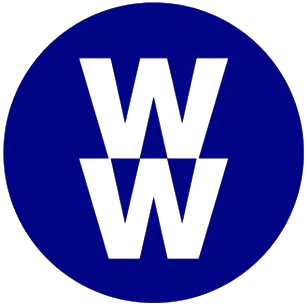
By 2012 Weight Watchers had a stacked wordmark from Paula Scher at Pentagram: two W’s, and the rest of the name spelled out. You could say it. You knew what it was for. On 24 September 2018 the company became WW. CEO Mindy Grossman would not say what the letters stood for. They were “a marque.” The line was Wellness that Works.
The brief was to get away from the weigh-in. Gail Tifford wanted bold, strong, modern. The mark was two W’s, one inverted, in a circle. Pentagram was not involved. People who had joined to lose weight were now in a wellness brand that would not say the word.
WW could mean anything
That was the point, and also the failure. A spoken name that you have to explain is not a name yet. WW could be a wrestling company, a war, a wallpaper forum. Weight Watchers is a sentence. Shame is a real design problem. Erasing the product is a different one. You can talk about wellness without hiding the thing people actually came for.
The letters never quite worked in the mouth. Members still said Weight Watchers. Journalists still said Weight Watchers, then added “now WW.” A rebrand that needs a parenthetical has not landed. HBO Max learned a cousin of this when Max would not inherit HBO. Yahoo kept purple and lost the drawing that made purple mean Yahoo. Initials are not a shortcut to dignity. They are a bet that the old words were the embarrassment. Sometimes the old words were the product.
The words came back in 2025
In December 2025, after Chapter 11 and a turn toward GLP-1 programmes, Weight Watchers put the words back. Tara Comonte, who had taken over as CEO, said they needed to show up as Weight Watchers. Mrs&Mr drew a new wordmark with a progress bar between the two W’s. Not Scher’s drawing. The name again. Creative Review covered the identity; Fast Company covered the Ozempic-era relaunch.
The progress bar is a metaphor you can see. It is also, finally, attached to the words people already knew. Seven years of WW did not make WW mean wellness. It made a well-known company look like it was trying not to be recognised at the chemist.
A logo for a weight-loss company has an unkind job. It has to be honest enough to find and kind enough to live with. Scher’s stacked name did both. Two inverted W’s in a circle did neither. The 2025 mark is a compromise: the sentence is back, with a little diagram of progress sitting in the middle of it. Compromise is allowed. Hiding the sentence was not.
- Weight Watchers becomes WW as it moves towards “wellness”, Alina Polianskaya, Design Week, 27 September 2018
- Mrs&Mr draws on the legacy of WeightWatchers in new identity, Creative Review, 2025