- Year —
- 1999–2015
- Designer —
- Google Design
- Outcome —
- Kept
Product Sans is still the wordmark.
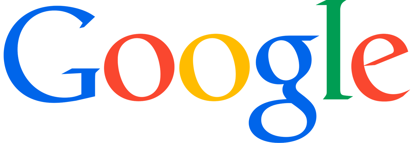
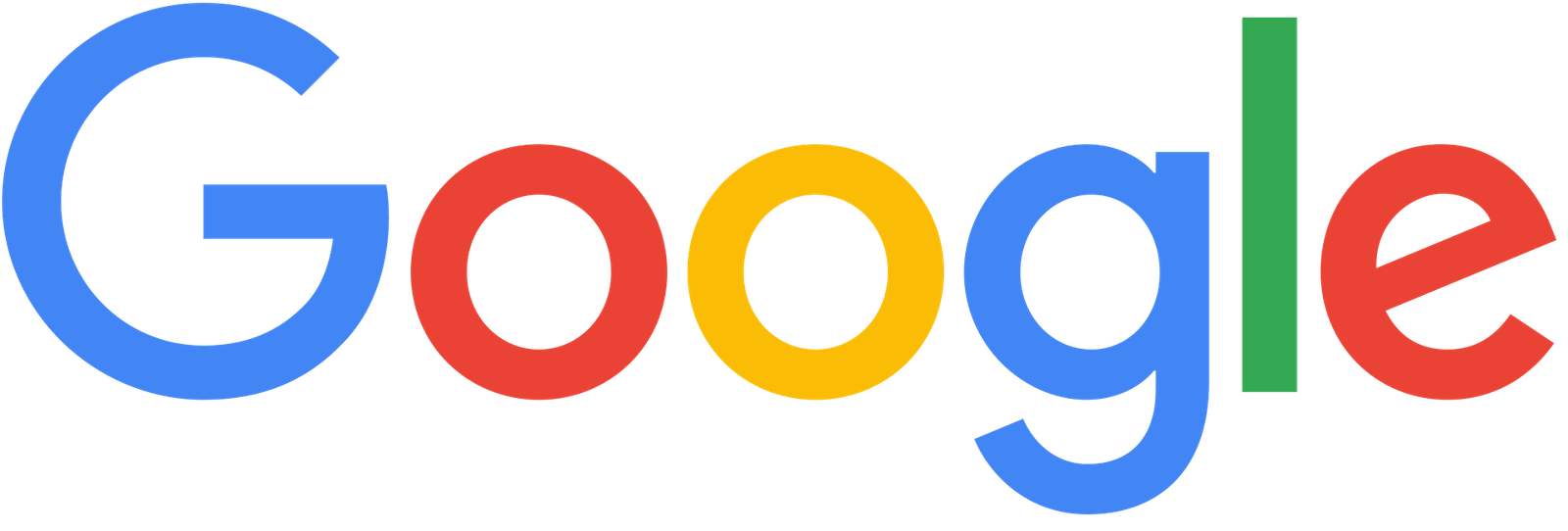
Google’s letters, from the late 1990s to 2015, were Catull: a serif with too much personality for a utility. The colours did some of the smiling. The G was almost a cartoon. The e leaned. You could see it on a billboard with the colours turned down and still know it, which is a test most tech wordmarks now fail on purpose.
In 2013 the drop shadows came off. On 1 September 2015 the serif came off too. The company blog, Google’s look, evolved, said phones, watches, cars, TVs. They added a four-colour G and a geometric face called Product Sans. The blue lowercase g icon went away. What remained was a system that could live on a watch face and on a bus, in the same geometry.
Distinctiveness moved to the four-colour G
Product Sans is clean at small sizes. It is also what a lot of tech companies look like once they decide serifs are a desktop habit. The personality that used to sit in the word moved into a separate G mark, which is a reasonable systems decision and a loss for the word. If you cover the G, Google’s letters are now a well-spaced sans in primary colours. Plenty of other products can rent that feeling.
Catull was slightly goofy. Search is slightly goofy. A utility that still wanted to feel like a toy had type that agreed. Product Sans feels like a product. That sentence is a compliment in a hardware meeting and a demotion on a homepage.
Intel dropped its swirl five years later for a sturdy custom sans with a square i. Yahoo had already flattened its exclamation into a weekend geometric. The pattern is not a conspiracy. It is what happens when every company in the same category hires for the same constraint: must work at 16 pixels, must not look like 2004. The constraint is real. So is the pile-up.
The serif is not coming back
Product Sans is still the Google logo. Kids who learned to type after 2015 have never seen Catull as the face of the company. That does not make Catull worse in hindsight. It makes the 2015 choice a one-way door. Google can redraw the G a dozen times. Putting the lean back in the e would look like a costume.
A search company’s wordmark has an unusual job. It sits above the box you type into. It has to be friendly without being a clown, and specific without fighting the results. Catull was specific. Product Sans is friendly in the way a lot of other friendly things are. The four-colour G now does the identifying. Reasonable as a system. A loss for the word.
- Google’s look, evolved, Google, 1 September 2015