University of California
- Year —
- 1910–2012
- Designer —
- UC Office of the President
- Outcome —
- Reverted
Suspended within days. The seal stayed.
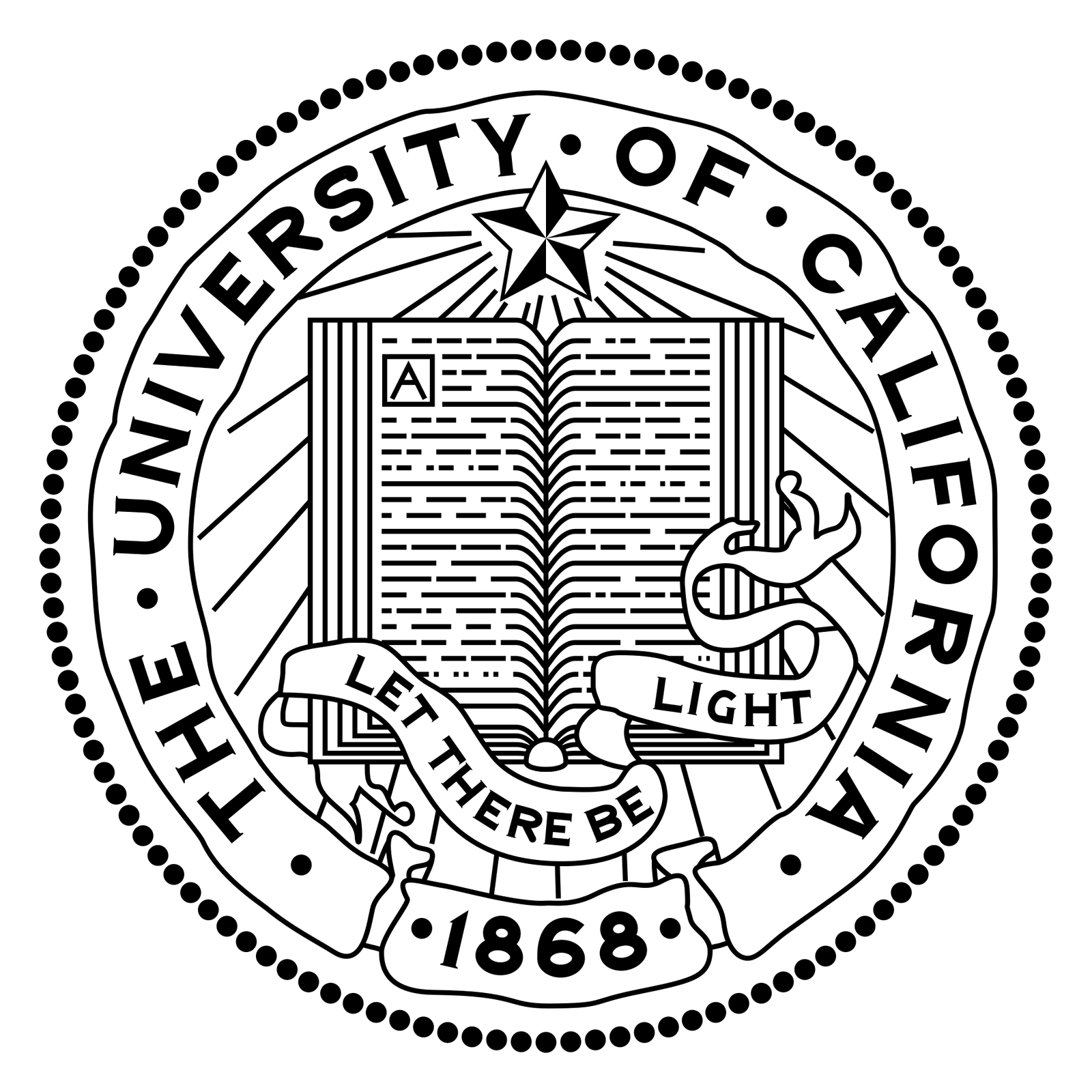

The University of California seal is an open book under a star, Let There Be Light, founding year 1868. Ornate on purpose. Slow to read, which is the point on a diploma. You are not supposed to glance at a seal. You are supposed to notice that someone sat still long enough to draw a book.
In late 2012 a blue U with a fading yellow C started showing up on system materials. Students and alumni treated it as a replacement. Officials said the seal would stay on diplomas; the monogram was for screens and for telling the ten-campus system apart from any one campus. That distinction did not travel. Once people saw the U as the face of UC, the seal was already in trouble.
Alumni compared the U to a toilet
A petition gathered tens of thousands of signatures. Photoshop jokes did the rest. On 14 December 2012 Daniel Dooley suspended further use. He called the criticism swift and brutal. The Los Angeles Times and the San Francisco Chronicle both had to write about a university logo as if it were a civic event, because for alumni it was.
The university had been using the graphic quietly for months. The revolt started when people saw it as the face of UC. That is the usual arc for a “secondary” mark. You design it for the letterhead. It leaks onto the homepage. Someone puts it on a T-shirt. Suddenly it is the logo, and the seal looks like a watermark you forgot to remove.
A corporate U is a shortcut for a phone. A seal is a picture of an institution that does not want to look like a phone company. They are not the same object, and they should not have been asked to share a job. Gap tried to keep a scrap of blue while throwing away the box. UC tried to keep the seal while publishing a U that looked like it wanted the seal gone. People believed the U.
A seal is allowed to be slow
Higher education has spent twenty years being told to look more like a brand. Some of that advice is about websites that work. Some of it is about monograms that could belong to a bank. The UC U was the second kind. It did not tell you about light, or a book, or 1868. It told you the organisation had a design department.
Cracker Barrel took a person off a sign and found out the person was the sign. UC published a letter and found out the letter was not the university. Both reversions happened fast, because the audience already had a picture and did not need a new one.
The monogram was pulled. The seal stayed. If you still see that blue U in a forgotten PDF, it is a reminder that secondary marks do not stay secondary once they are prettier than the thing they were meant to sit beside.
- UC drops controversial new logo, Larry Gordon, Los Angeles Times, 15 December 2012
- UC suspends use of logo, San Francisco Chronicle, December 2012