Pepsi
- Year —
- 2003–2008
- Designer —
- Arnell Group
- Outcome —
- Reverted
The 2023 globe put the word back in the circle.
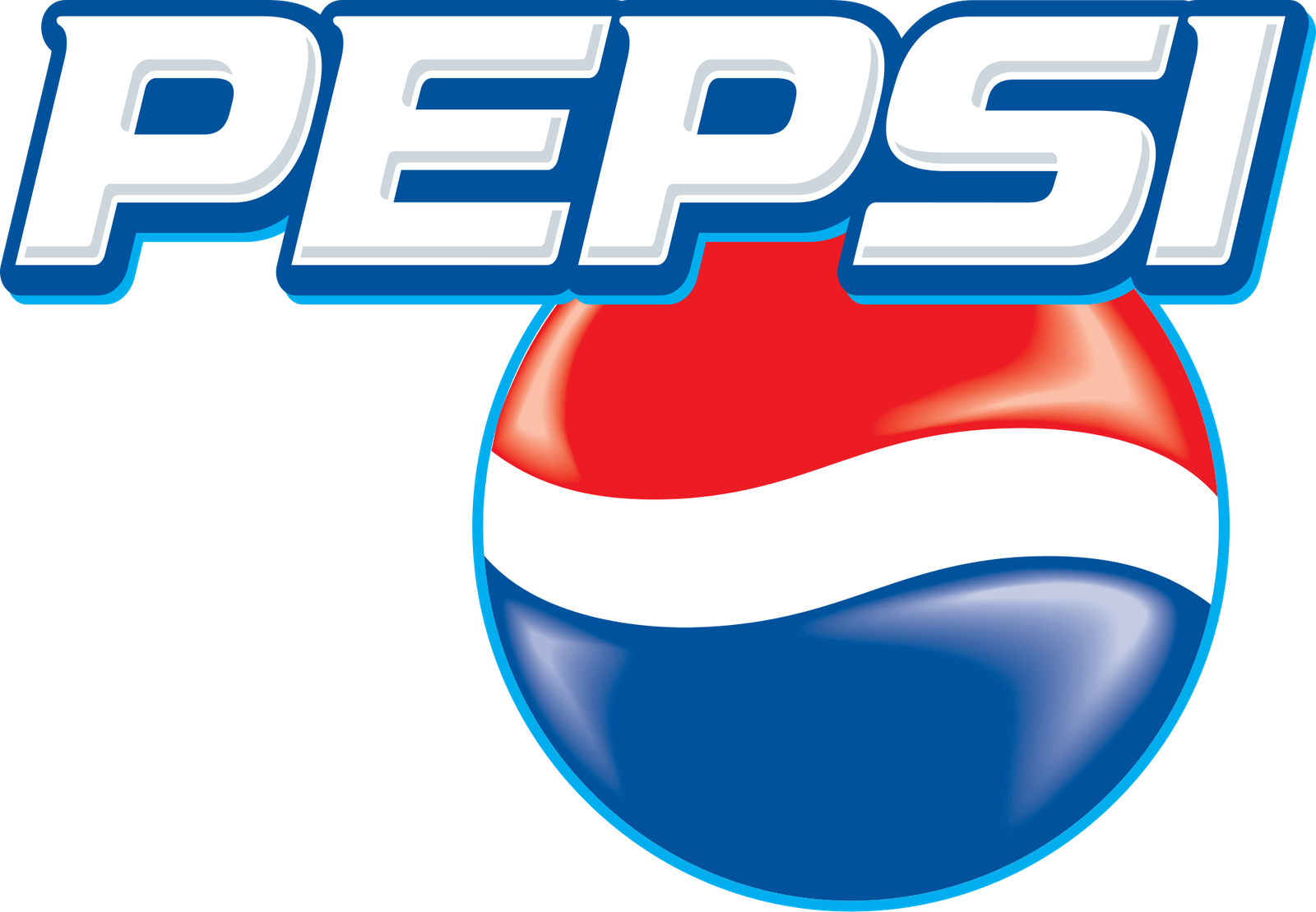
For years the word Pepsi sat in the white band of the red-white-blue globe. You could not miss it. The globe was the name, and the name was the globe. That is a tighter piece of branding than most beverage companies ever get, and Pepsi had been circling it in one form or another since the 1970s.
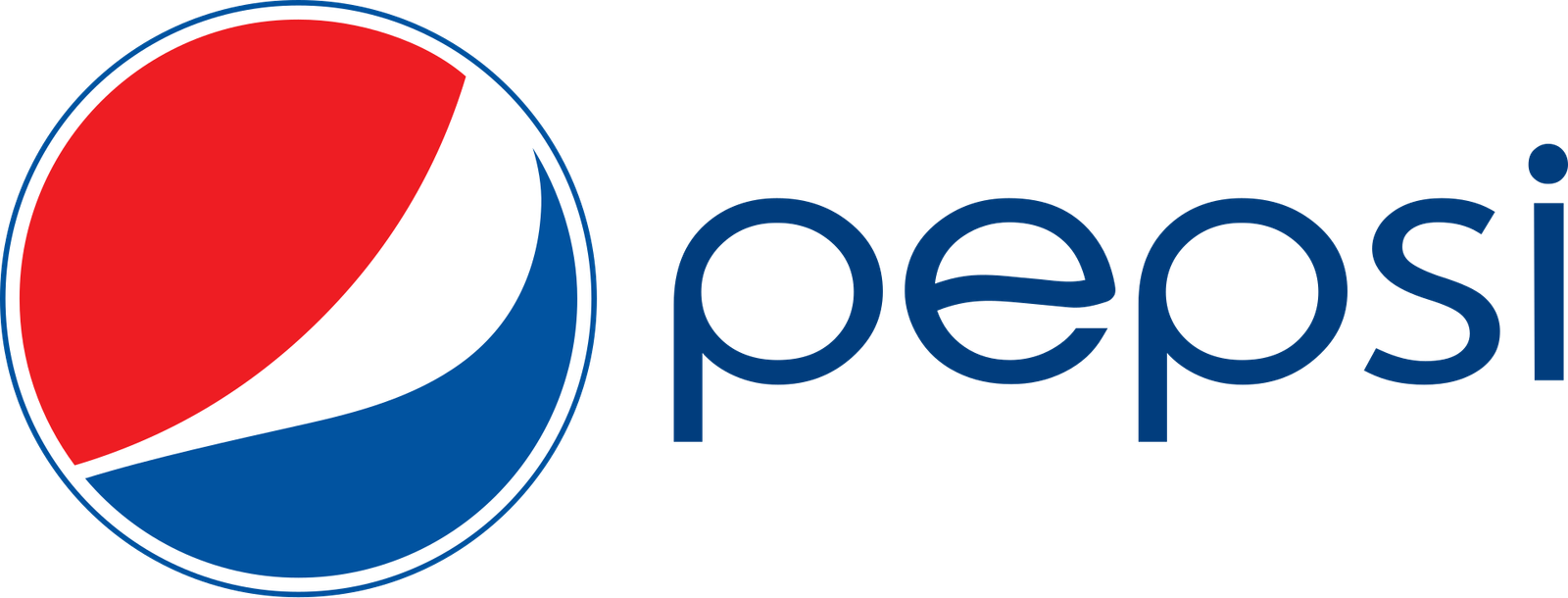
In 2008 the Arnell Group pulled the letters out and bent the band into a lopsided smile. A leaked deck, Breathtaking, compared the geometry to the Mona Lisa and the earth’s magnetic field. The drawing on the can was simpler than the memo: a lowercase pepsi next to a disc that no longer held the name. The smile was supposed to feel human. On a cooler door it felt like half a logo.
When the letters leave the circle
A Pepsi globe without Pepsi in it is a decoration looking for a caption. You can lose either half. In a vending machine the disc competes with every other roundel. On a cup the word sits beside the mark instead of inside it, so a crop, a fold, or a dirty fridge can take the name away and leave a smile that could belong to a toothpaste.
They kept that smile until 2023. Then PepsiCo Design & Innovation put a bold wordmark back in the middle of a flat circle, closer to the 1970s mark than to the smile. Graphic Design USA described it as uniting globe and wordmark. That is a polite way of saying the 2008 split had not been an improvement.
Arnell did Tropicana the next year and took the orange off the carton. The instinct is consistent: isolate a pleasing shape, move the identifying matter somewhere else, write a document about why the shape is profound. Shoppers do not read the document. They look for the word in the white band, or the straw in the fruit.
Fifteen years is a long time to be beside yourself
Pepsi did not snap back in a week. The smile sat on cans through a generation of Super Bowls. That does not make it the better globe. It makes it a stuck decision, the way Google is still in Product Sans and UPS is still a shield with no parcel. Some of those stuck marks are fine. Pepsi’s 2023 return to a named circle is an unusually clear admission that the letters belonged inside the object all along.
When the letters live inside the band, the globe and the name are one thing. When they live beside it, you can lose either half in a cooler. A cola logo that can lose its name has already started to lose the cooler.
- Pepsi Globe, Wikipedia
- Pepsi Logo Unites Globe and Wordmark, Graphic Design USA, 2023