UPS
- Year —
- 1961–2003
- Designer —
- FutureBrand
- Outcome —
- Kept
The shield stayed. The parcel never came back.
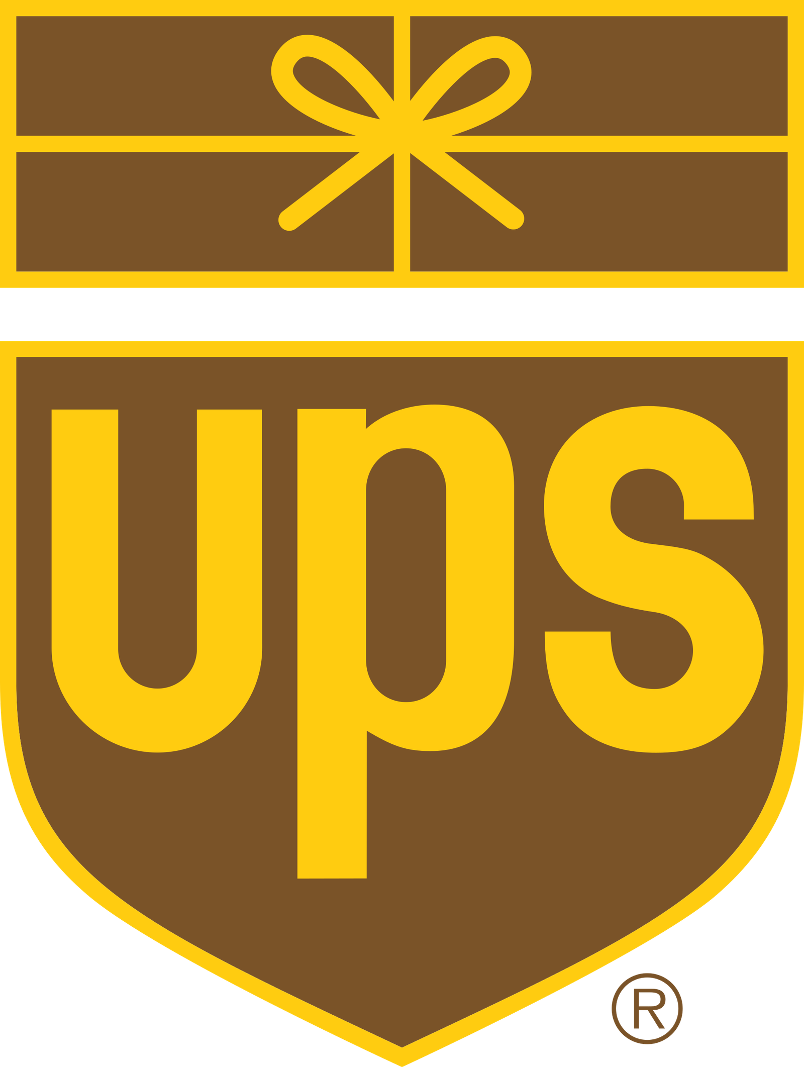
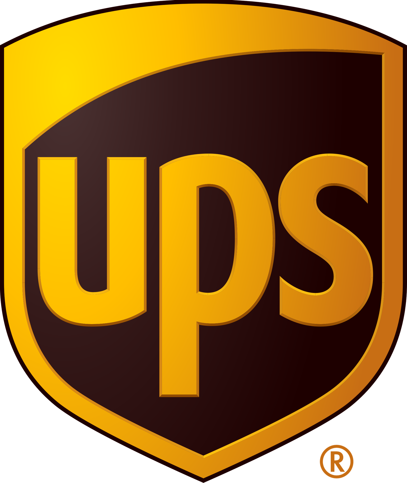
Paul Rand’s 1961 UPS mark was a brown shield, three letters, and a tiny package tied with a bow. Sorting machines had already banned string-tied parcels, so the bow was a memory of the job, not a picture of the current one. That is allowed. Logos are allowed to remember. The package told you what the brown trucks were for, in a language you could still read on a street corner.
In March 2003 FutureBrand took it off. Two years of work, a push into freight and finance, Mail Boxes Etc. becoming The UPS Store. The public line was that a bow-tied parcel no longer described the business. The new shield kept the letters and the brown, added gold, and got a bevel the press kit called impact. The ad line was “Synchronizing the world of commerce.”
A badge is not a caption
Armin Vit wrote about the missing package the day it launched, on Speak Up. UPS did not put it back. Twenty-odd years later the trucks are still brown and the shield is still a shield. The parcel is a trivia question.
A shield with UPS on it is a badge. A badge with a parcel on it is a caption. The caption was the part that could not belong to a bank. FutureBrand’s brief was that UPS had become more than packages. Fine. Taking the package off did not make the company look like logistics at a higher altitude. It made the mark look like it could be bolted onto any brown service.
Adweek recorded the 43-year gap. Rand’s drawing had already outlived the string. FutureBrand’s drawing has now outlived Rand’s, which is not the same as having improved it. Longevity is not an argument if the thing that lasted is a flatter version of the thing that was good.
Brown did the heavy lifting
What survived is colour and three letters. That is a lot. UPS brown is still one of the few corporate colours you can name without a swatch. The 2003 work trusted the colour to carry the identity once the bow was gone. Colour can do that. It cannot tell you that the company carries things. Rand had both.
American Airlines hired FutureBrand a decade later and retired Vignelli’s eagle for a clever tail. Intel later dropped a swirl that had made the name a sealed object. Subtract the pictogram, keep the letters, call it a system. Sometimes the system is the point. Sometimes the pictogram was the system, and what you have left is a nicely bevelled abbreviation.
The parcel never came back. If you still see a tiny bow on a vintage truck or a collector pin, that is not heritage branding. That is the caption leaking through.
- UPS Says Bye-bye to Rand, Armin Vit, Speak Up, 25 March 2003
- UPS Changes Logo After 43 Years, Adweek, 2003